Visualising world population density
Something to explore over Holidays. Enjoy!
Aleks
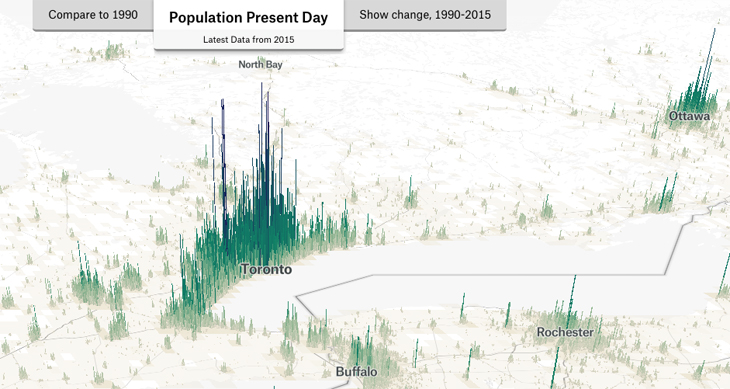
This project wields data from the Global Human Settlement Layer, which uses “satellite imagery, census data, and volunteering geographic information” to create population density maps.
Visualising world population density as an interactive multi-scale map using the global human settlement population layer.
Much more serious paper about this issue
ABSTRACT:
Recent advances in global population data are enabling new cartographic and analytical opportunities. The Global Human Settlement Layer is the first sub-1 km cell resolution global population density product released as open data, with many applications in the fields of global population dynamics, urban studies and natural hazard risk. There are several cartographic challenges with visualising this dataset due to the range of spatial scales that are of interest, and the extensive variation in the density of settlements patterns that exist across different regions of the globe. These challenges are tackled here using interactive mapping, allowing navigation from global to city-region scales. A detailed classification and colour scheme is developed to distinguish a wide range of densities at multiple scales. Additionally, interactive statistics are presented for direct numerical comparisons at both country and city scales, further enabling global density comparisons. The interactive map produced has received 30,000 users in four months, indicating the widespread interest in understanding global population density.


Leave a Reply